What Secrets Car Logos Keep: Stories Behind Car Brands You Didn’t Know
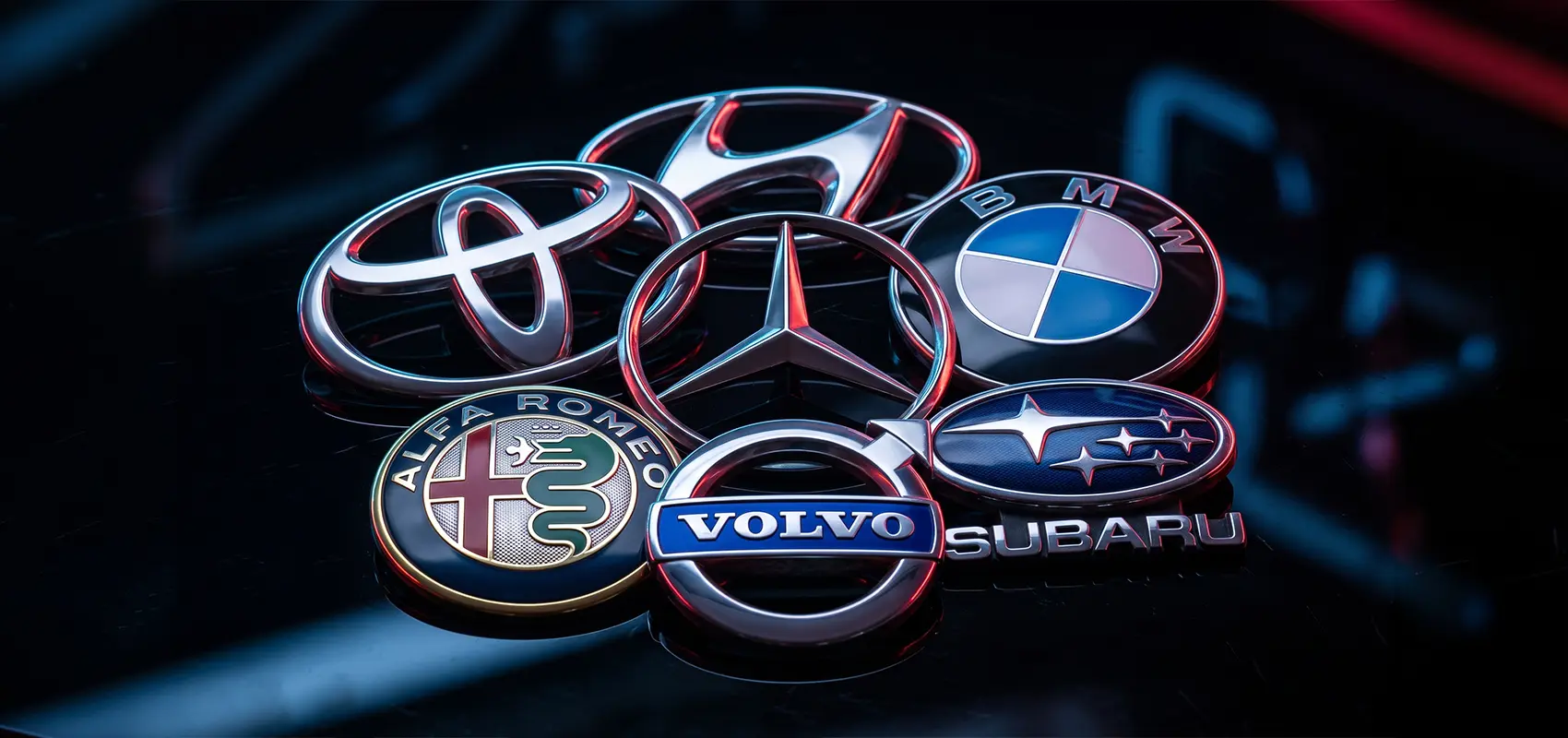
You look at them every day, yet you miss the obvious details. That beautiful hood badge isn't just a designer's whim - it’s a coded message. Some brands hide the eye of a needle in their logos, while others conceal eerie medieval scenes. The Indy Auto Man, a prominent Indianapolis car dealership, uncovers a few secrets behind automotive emblems.
Toyota: A Puzzle in the Eye of a Needle
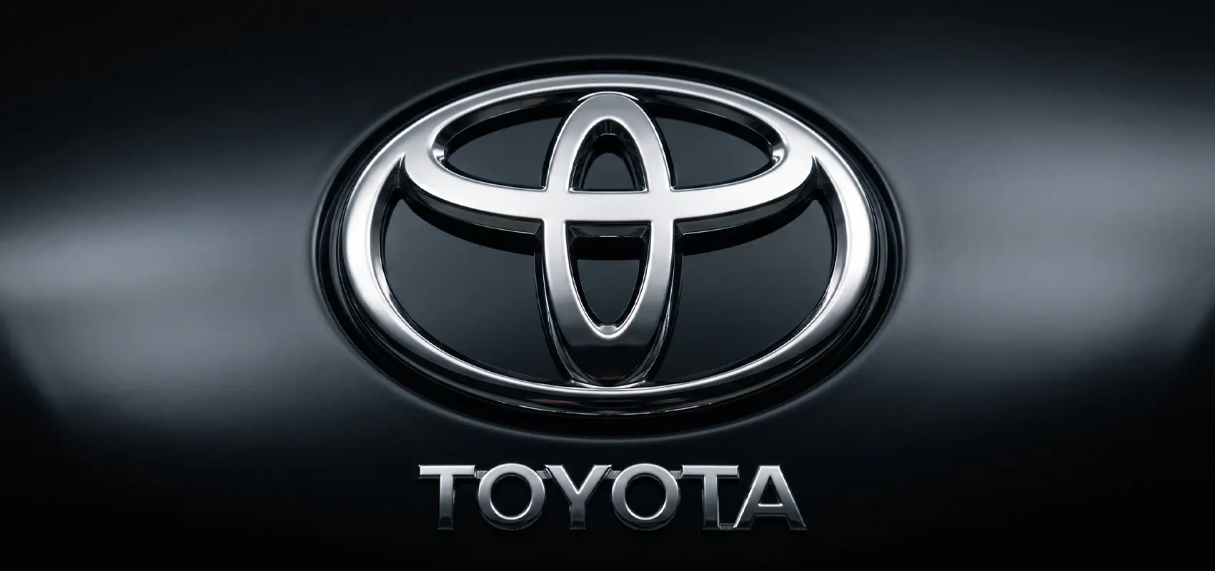
The Toyota emblem is a genuine puzzle. Take a close look at where the two ovals intersect. Do you see the narrow opening in the center? That is the eye of a needle, with an invisible thread passing through it. It serves as a reminder of the background of the brand's founder, Sakichi Toyoda, who started out manufacturing weaving looms.
But the designers' cleverest trick is a favorite among linguists: if you break the logo down into its component parts, you can spell out T-O-Y-O-T-A. The three ellipses also symbolize three "hearts": the owner, the car, and progress. They are intertwined so closely that they form an infinity symbol.
You can find several Toyota models with this emblem in the Indiana car inventory - perfect for seeing how the logo looks on modern vehicles.
Hyundai: A Secret Handshake
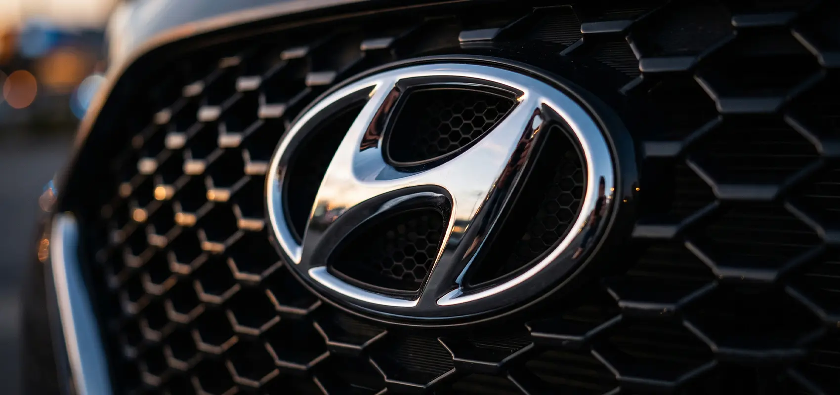
The slanted letter "H" isn't just the brand's initial; it is a cleverly encoded scene of a deal being struck - specifically, a handshake between two people. The left stroke of the letter leans toward the right, depicting a company representative handing the keys over to a customer.
The designers deliberately tilted the angle to inject dynamism into what would otherwise be a static image. In South Korea, the word "Hyundai" signifies "modernity" and moving forward. So, while other brands took pride in their history, Hyundai was literally flooring the gas pedal.
BMW: The Great Aviation Myth
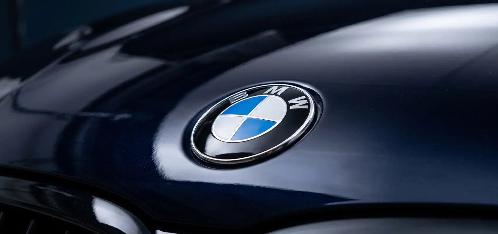
The center of the BMW emblem does not depict a spinning airplane propeller, despite what years of advertising have told us. This legend emerged only a decade after the logo’s debut, when marketers sought to highlight the brand’s aviation heritage.
In reality, the blue and white sectors are fragments of the Bavarian flag, simply reversed. At the time, laws prohibited the use of state symbols in commercial activities, so the colors were rearranged. The emblem inherited its black rim from Rapp Motorenwerke - the legendary brand’s predecessor. T
Thus, what we see is not a propeller, but a coded reference to the company's place of origin.
Subaru: A Map of the Starry Sky
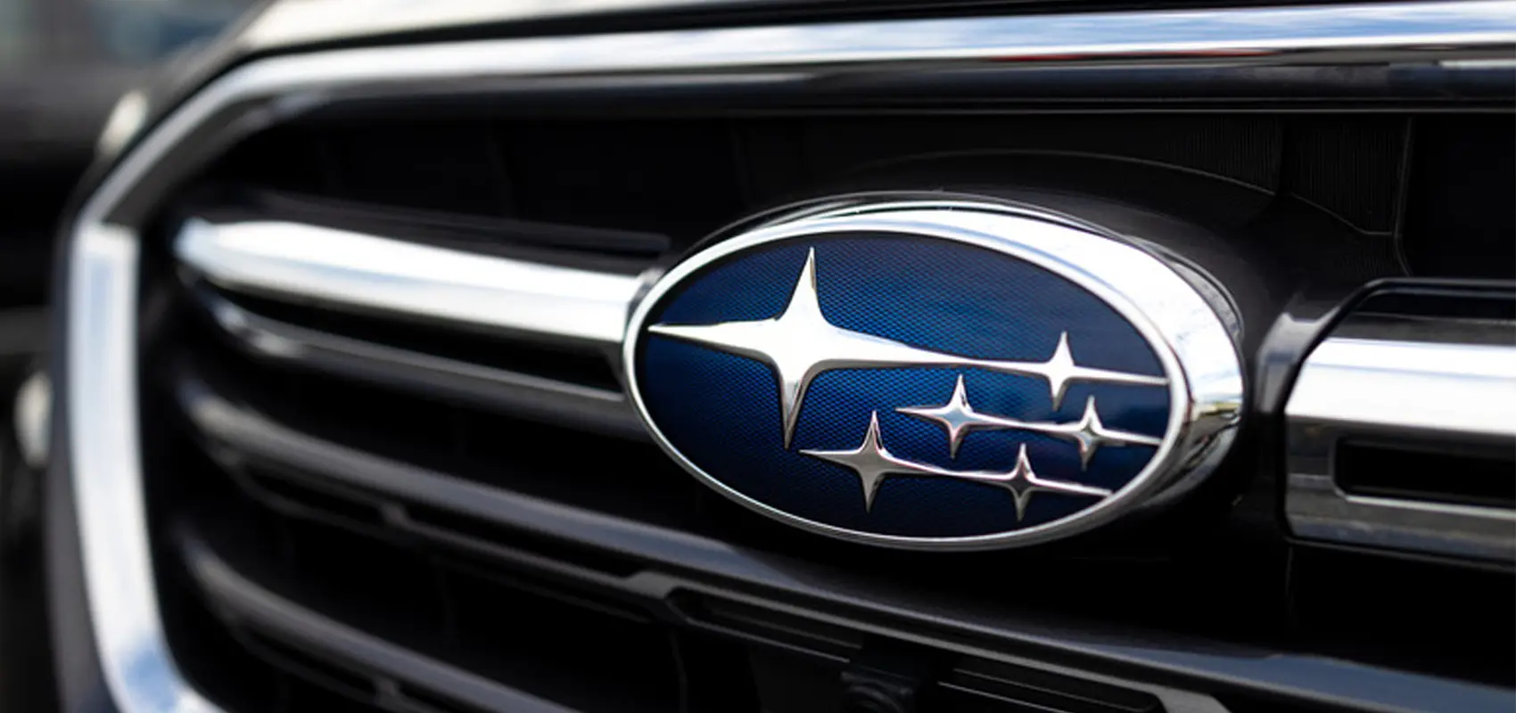
In Japanese, "Subaru" translates to "Pleiades" - a star cluster in the constellation Taurus. The logo features six stars, mirroring the number visible to the naked eye in the night sky. Yet, it represents more than just the cosmos; the six stars symbolize the companies that merged after World War II to form the Fuji Heavy Industries conglomerate.
The largest star on the left represents the parent company, while the five smaller ones represent its partners. The word "Subaru" also signifies "coming together." The Japanese effectively placed a map of this union on the hood, illustrating that while surviving alone in this world is difficult, together one can reach for the stars.
Alfa Romeo: The Man-Eater from Milan
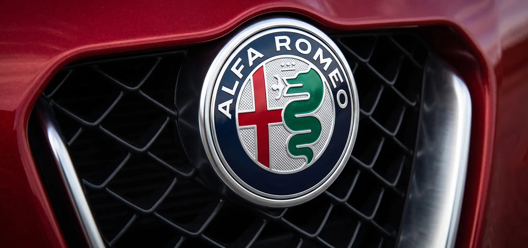
The Alfa Romeo logo is straight out of a medieval thriller. The left side is simple and serene: a red cross on a white background - the coat of arms of Milan, the brand's birthplace. The right side, however, is the stuff of horror: a massive azure serpent devouring a human. This is the symbol of the powerful Visconti family, who ruled Milan during the Renaissance.
Legend has it that during a Crusade, a member of the Visconti family slew a Saracen giant whose shield bore the image of a serpent devouring a child. The victor claimed this chilling symbol as a trophy. Alfa Romeo marketers insist that the serpent isn't devouring a human; rather, a new, purified hero is being born from the monster's maw.
Yet, looking at the emblem, one realizes that a car with such a wild spirit is ready to swallow anyone who fails to tame its power.
Volvo: The Alchemy of Swedish Armor
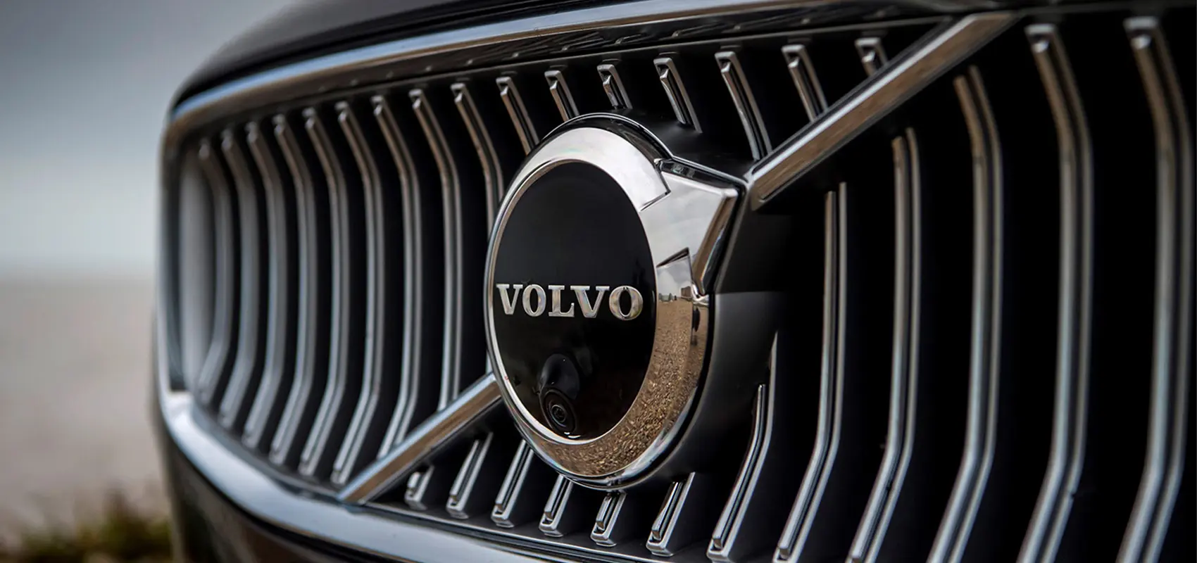
Many mistake the Volvo logo for the "male" symbol found on restroom doors, but it actually encodes the history of an industry. The circle with an arrow pointing up and to the right is the ancient alchemical symbol for iron - a sign used in Sweden for centuries. It represents not only the metal but also Mars, the god of war, symbolizing his shield and spear.
By adopting this emblem in 1927, the brand's founders were making a statement about the exceptional quality of Swedish steel. Even the diagonal bar across the radiator grille was a technical solution rather than a stylistic choice; it served to hold the heavy emblem in place.
Today, Volvo is synonymous with safety, yet the symbol of war remains on the hood - a coded message of strength and invulnerability.
Mercedes-Benz: Mastery Over Three Elements
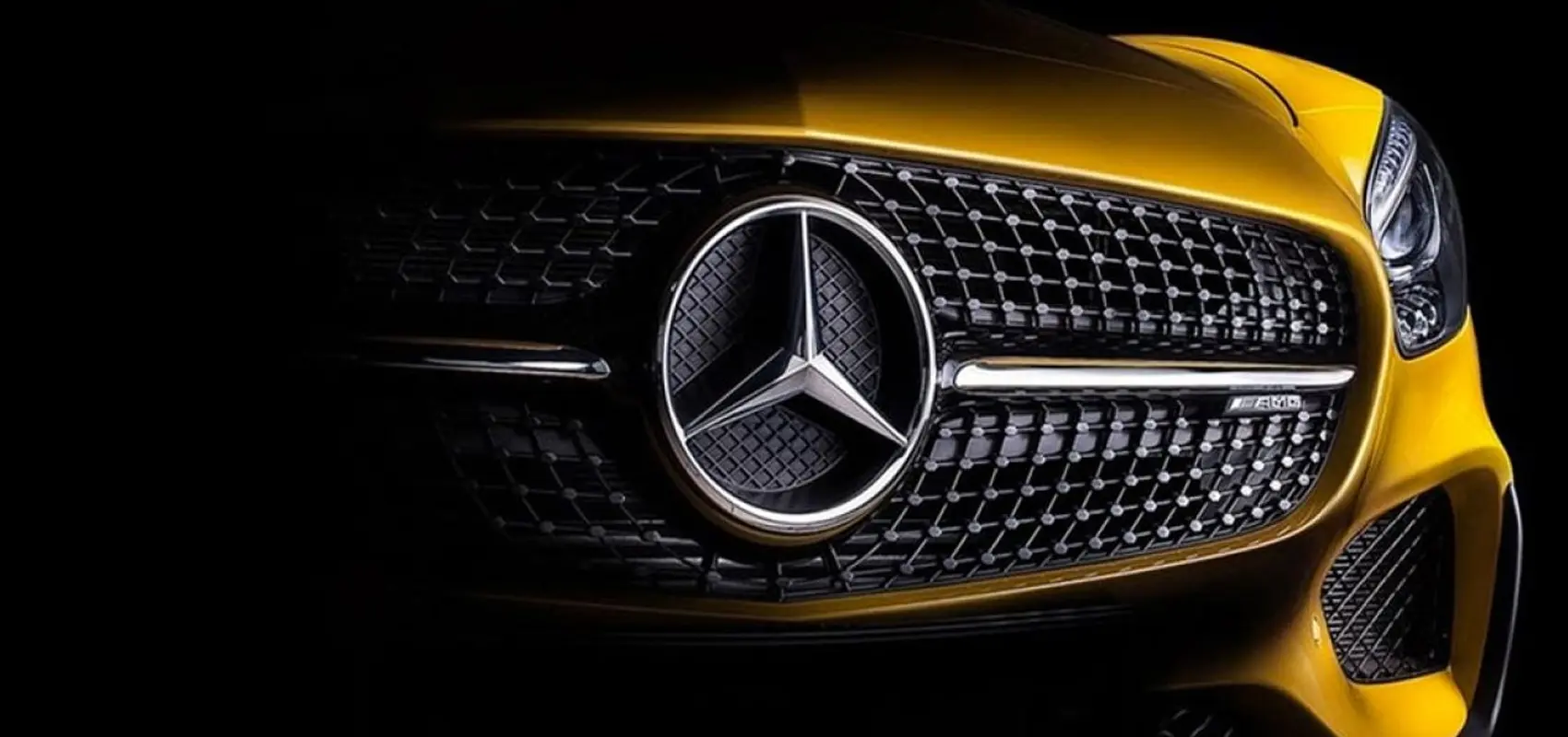
The Mercedes-Benz three-pointed star is not a reference to Stierlitz’s gun sight, but rather Gottlieb Daimler’s ambitious manifesto. Each point represents a different element: land, water, and air. In the early 20th century, the company had no intention of limiting itself to automobiles; its engines were designed to power vehicles on land, on water, and in the air.
In short, it was a symbol of total expansion. Legend has it that Daimler sketched the star on a postcard to his wife, writing that one day it would shine over his factory. The prophecy came true, and a personal dream of mastering the elements evolved into the most recognizable symbol of luxury on the planet.
So, the next time you’re stuck in traffic, take a closer look at the emblem on the car in front of you. Behind every logo lies a story - a family legend, the ambitions of engineers, or a medieval symbol that has endured for centuries. It is precisely these details that make the automotive world far richer and deeper than it appears at first glance.